1 First steps
1.1 Fuel economy data
Q1: List five functions that you could use to get more information about the mpg dataset.
A: First of all, you can search for its document by typing ?mpg in your R console.
Also, these are some useful functions that will give you information about variables type of dataset:
1- summary(mpg): gives you rough information like range, median, mean, etc. of each variable in the dataset.
2- str(mpg) or dplyr::glimpse(mpg): prints the name and the type of each variable of the dataset and displays some portion of the data. (dplyr::glimpse() is much tidier than str())
3- View(mpg): Opens a spreadsheet-style data viewer.
4- head(mpg): prints the top 5 rows of the dataset.
5- dim(mpg): prints the dimension of the dataset.
6- names(mpg): prints the names of the variables.
Q2: How can you find out what other datasets are included with ggplot2?
A: You can find a list of all data set included in ggplot2 using data():
data(package = "ggplot2")Q3: Apart from the US, most countries use fuel consumption (fuel consumed over fixed distance) rather than fuel economy (distance travelled with fixed amount of fuel). How could you convert cty and hwy into the European standard of l/100km?
A: To convert miles per gallon to liters per 100 kilometers, we should divide (gallon_to_liter / mile_to_km) * 100 = 235.2392791 by the miles per gallon value:
gallon_to_liter <- 3.785
mile_to_km <- 1.609
mpg_to_L100km <- (gallon_to_liter / mile_to_km) * 100

mpg %>%
  transmute(cty,
            cty_L100km = mpg_to_L100km / cty,
            hwy,
            hwy_L100km = mpg_to_L100km / hwy)
#> # A tibble: 234 x 4
#>      cty cty_L100km   hwy hwy_L100km
#>    <int>      <dbl> <int>      <dbl>
#>  1    18       13.1    29       8.11
#>  2    21       11.2    29       8.11
#>  3    20       11.8    31       7.59
#>  4    21       11.2    30       7.84
#>  5    16       14.7    26       9.05
#>  6    18       13.1    26       9.05
#>  7    18       13.1    27       8.71
#>  8    18       13.1    26       9.05
#>  9    16       14.7    25       9.41
#> 10    20       11.8    28       8.40
#> # … with 224 more rows
Q3: Which manufacturer has the most models in this dataset? Which model has the most variations? Does your answer change if you remove the redundant specification of drive train (e.g. “pathfinder 4wd”, “a4 quattro”) from the model name?
A: For the first part of the question, you can use tally() to count the total number of models by manufacturer:
mpg %>%
  group_by(manufacturer) %>%
  tally(sort = TRUE)
#> # A tibble: 15 x 2
#>    manufacturer     n
#>    <chr>        <int>
#>  1 dodge           37
#>  2 toyota          34
#>  3 volkswagen      27
#>  4 ford            25
#>  5 chevrolet       19
#>  6 audi            18
#>  7 hyundai         14
#>  8 subaru          14
#>  9 nissan          13
#> 10 honda            9
#> 11 jeep             8
#> 12 pontiac          5
#> 13 land rover       4
#> 14 mercury          4
#> 15 lincoln          3
Now for the second part, let’s check all the unique models that are in the dataset:
mpg %>%
  select(model) %>%
  unique()
#> # A tibble: 38 x 1
#>    model
#>    <chr>
#>  1 a4
#>  2 a4 quattro
#>  3 a6 quattro
#>  4 c1500 suburban 2wd
#>  5 corvette
#>  6 k1500 tahoe 4wd
#>  7 malibu
#>  8 caravan 2wd
#>  9 dakota pickup 4wd
#> 10 durango 4wd
#> # … with 28 more rows
There are 4 redundant specifications (“quattro”, “4wd”, “2wd”, “awd”). for removing these strings from the model names, we can use str_replace_all():
mpg %>%
  mutate(model = str_replace_all(model, c("quattro" = "",
                                          "4wd" = "",
                                          "2wd" = "",
                                          "awd" = "")) %>% str_trim()) %>%
  group_by(manufacturer, model) %>%
  tally(sort = TRUE)
#> # A tibble: 37 x 3
#> # Groups:   manufacturer [15]
#>    manufacturer model               n
#>    <chr>        <chr>           <int>
#>  1 audi         a4                 15
#>  2 dodge        caravan            11
#>  3 dodge        ram 1500 pickup    10
#>  4 dodge        dakota pickup       9
#>  5 ford         mustang             9
#>  6 honda        civic               9
#>  7 volkswagen   jetta               9
#>  8 jeep         grand cherokee      8
#>  9 subaru       impreza             8
#> 10 dodge        durango             7
#> # … with 27 more rows
1.2 Key components
Q1: How would you describe the relationship between cty and hwy? Do you have any concerns about drawing conclusions from that plot?
A: To understand the relationship, we need to make a plot:
ggplot(mpg, aes(cty, hwy)) +
  geom_point()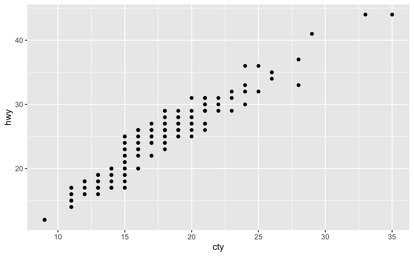
This plot shows that there is a direct (increasing) linear relationship (correlation).
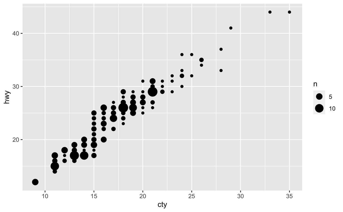
But there is a concern about the “overplotting” (plotting many points on top of each other). To handle this problem, we can use geom_jitter() (check section 2.6.2) or geom_count() (check section 10.4) instead of geom_point() (another way is to set alpha = 0.3 in geom_point()):
ggplot(mpg, aes(cty, hwy)) +
 geom_jitter()
ggplot(mpg, aes(cty, hwy)) +
  geom_count()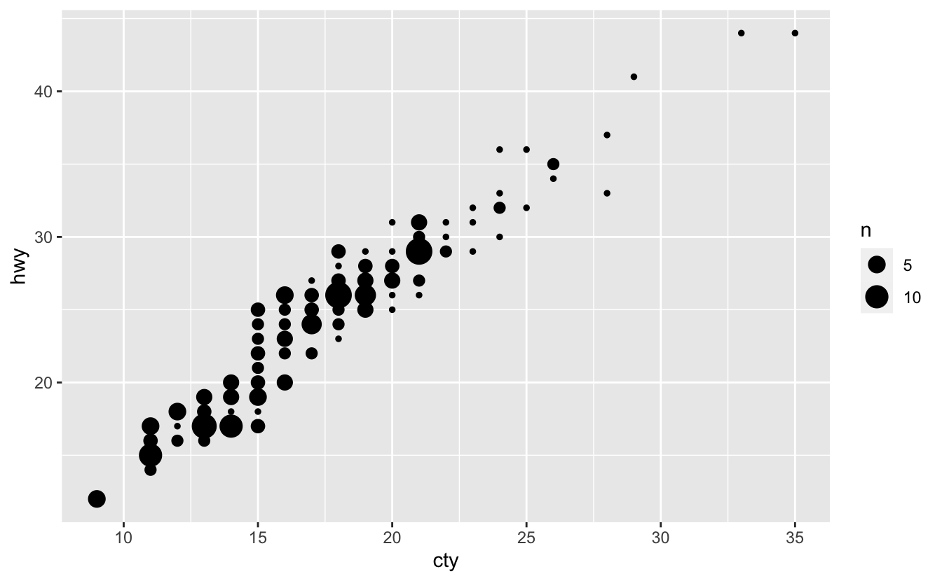
Q2: What does ggplot(mpg, aes(model, manufacturer)) + geom_point() show? Is it useful? How could you modify the data to make it more informative?
ggplot(mpg, aes(model, manufacturer)) +
  geom_point()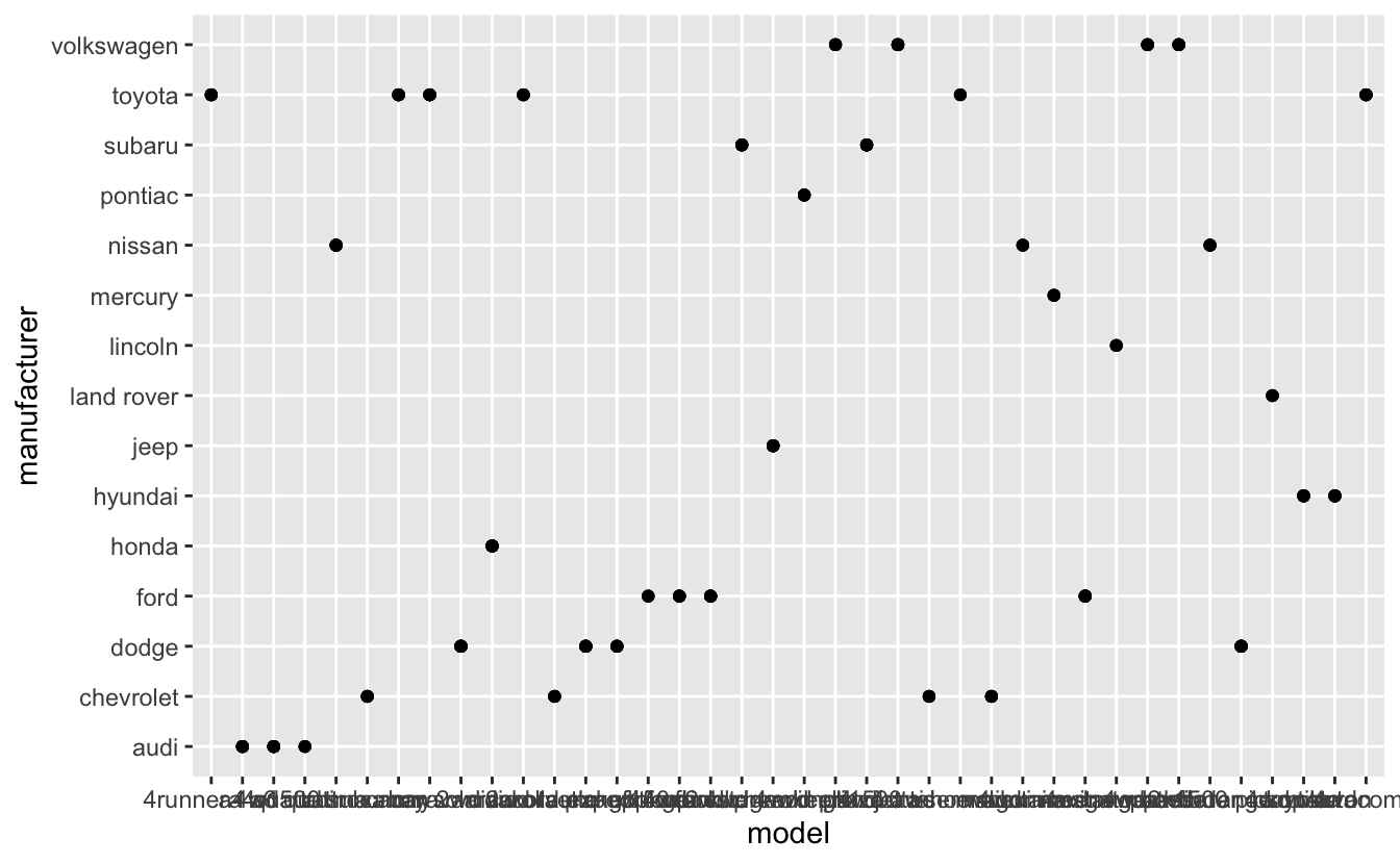
A: Each dot represents a different manufacturer-model combination that are in dataset; But is not useful, because the x-axis ticks are not readable.
We can flip the x and the y mappings:
ggplot(mpg, aes(manufacturer, model)) +
  geom_point()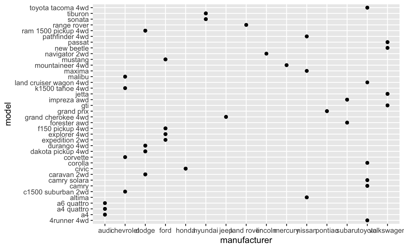
Another way is that to use total number of observations for each manufacturer-model combination and geom_bar() (check section 2.6):
mpg %>%
  transmute("manu_mod" = paste(manufacturer, model)) %>%
  ggplot(aes(manu_mod)) +
  geom_bar() +
  coord_flip()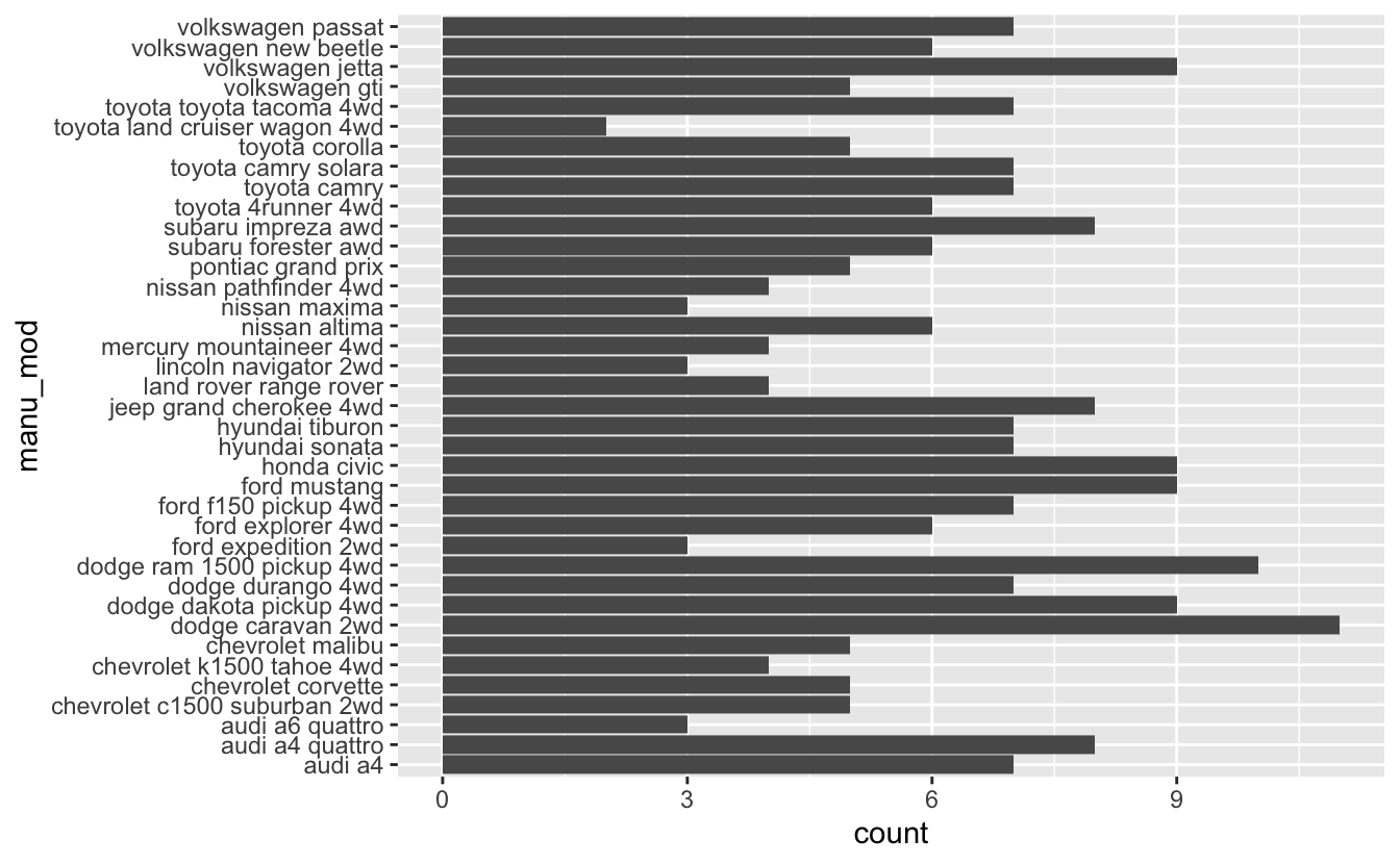
Q3: Describe the data, aesthetic mappings and layers used for each of the following plots. You’ll need to guess a little because you haven’t seen all the datasets and functions yet, but use your common sense! See if you can predict what the plot will look like before running the code.
A:
Datasets:
For datasets, use ?dataset_name.
?mpg
?diamonds
?economics
Aesthetic mappings: The first 3 plots, have explicit x and y aesthetics mappings. The last one has explicit x and implicit y (number of cases at each x position).
Layers:
There is one layer for each plot.
The first 2 plots use geom_point() which is used to create scatterplots.
The third one uses geom_line(). This geom connects them in order of the variable on the x-axis to create lines.
The last one uses geom_histogram(). This geom visualizes the distribution of a single variable, so the x-axis shows the binned variable and the y axis shows the number of observations in each bin.
1.3 Colour, size, shape and other aesthetic attributes
Q1: Experiment with the colour, shape and size aesthetics. What happens when you map them to continuous values? What about categorical values? What happens when you use more than one aesthetic in a plot?
A:
Mapping continuous values to colour aesthetic:
ggplot(mpg, aes(displ, hwy, colour = cty)) + geom_point()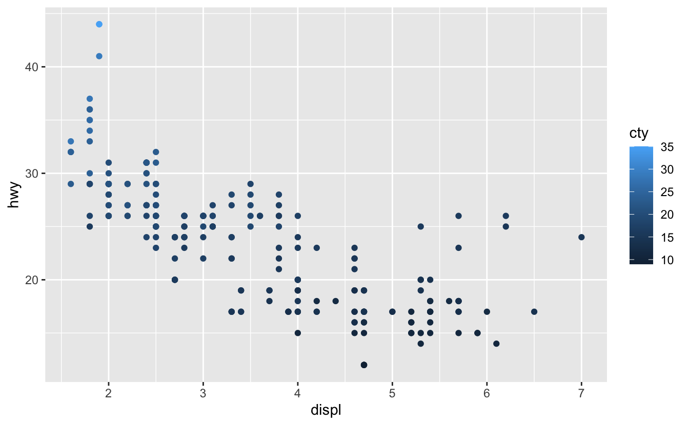
Mapping continuous values to shape aesthetic:
ggplot(mpg, aes(displ, hwy, shape = cty)) + geom_point()
#> Error: A continuous variable can not be mapped to shape
Mapping categorical values to shape aesthetic:
ggplot(mpg, aes(displ, hwy, shape = drv)) + geom_point()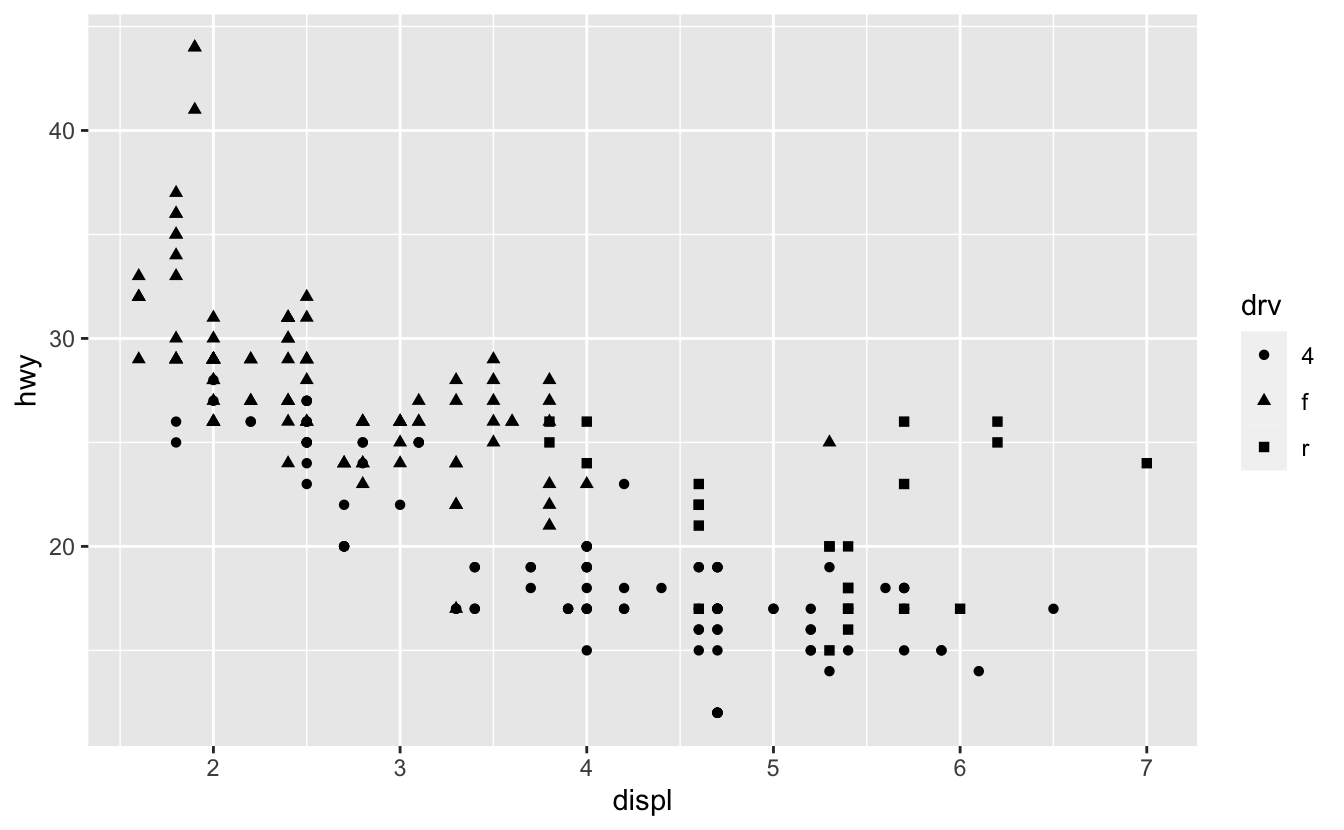
Mapping continuous values to size aesthetic:
ggplot(mpg, aes(displ, hwy, size = cty)) + geom_point()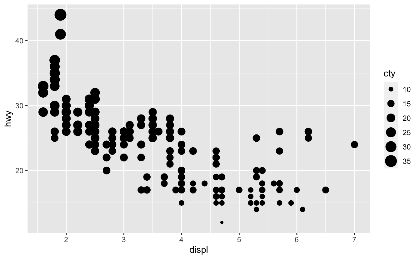
Mapping categorical values to size aesthetic:
ggplot(mpg, aes(displ, hwy, size = drv)) + geom_point()
#> Warning: Using size for a discrete variable is not advised.
Using multiple aesthetics:
ggplot(mpg, aes(displ, hwy, colour = manufacturer, shape = drv)) + geom_point()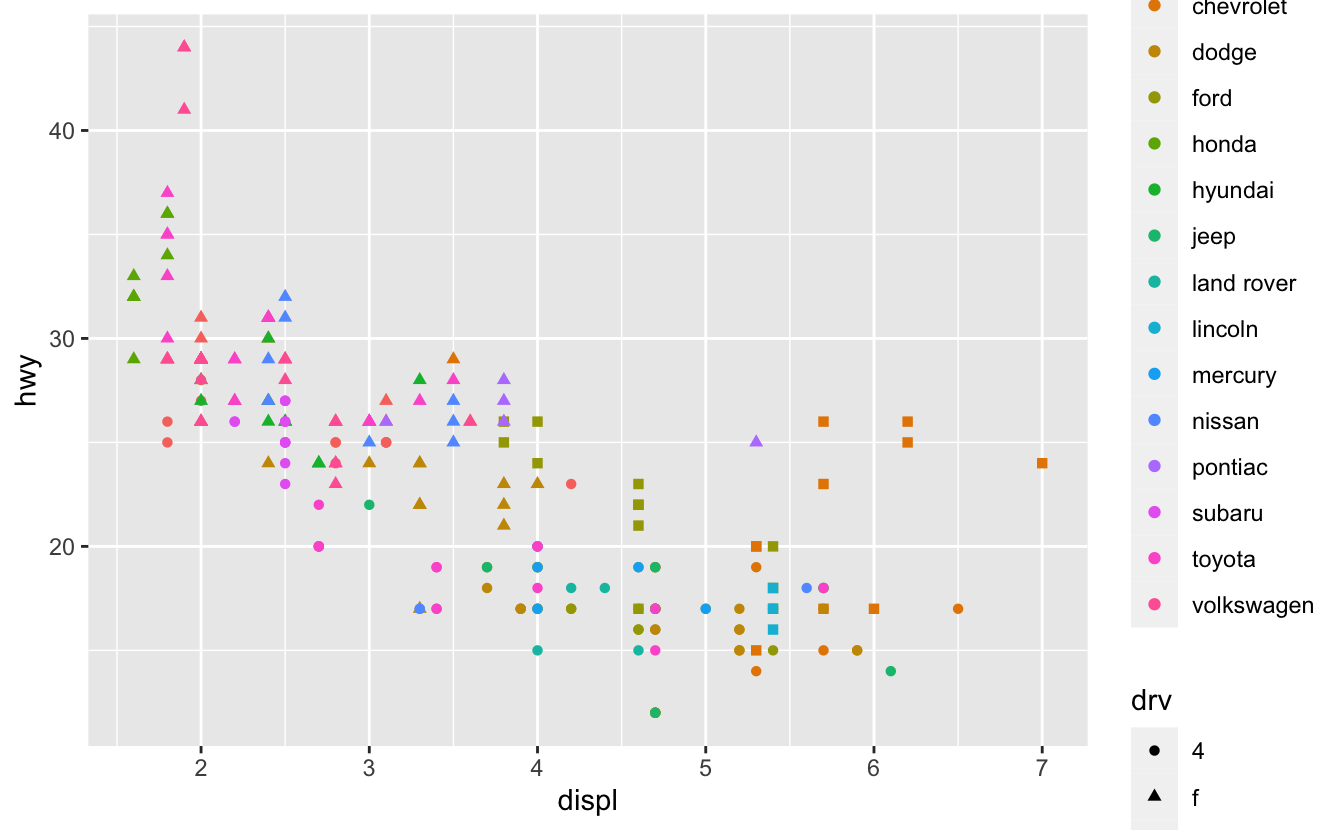
Q2: What happens if you map a continuous variable to shape? Why? What happens if you map trans to shape? Why?
A: If we map a continuous variable to shape aesthetic, it throws an error (because shape aesthetic doesn’t have a continuous scale):
ggplot(mpg, aes(displ, hwy, shape = cty)) + geom_point()
#> Error: A continuous variable can not be mapped to shape
when a categorical variable has more than 6 different levels, it’s hard to discriminate hence, we get a warning:
ggplot(mpg, aes(displ, hwy, shape = trans)) + geom_point()
#> Warning: The shape palette can deal with a maximum of 6 discrete values because
#> more than 6 becomes difficult to discriminate; you have 10. Consider
#> specifying shapes manually if you must have them.
#> Warning: Removed 96 rows containing missing values (geom_point).
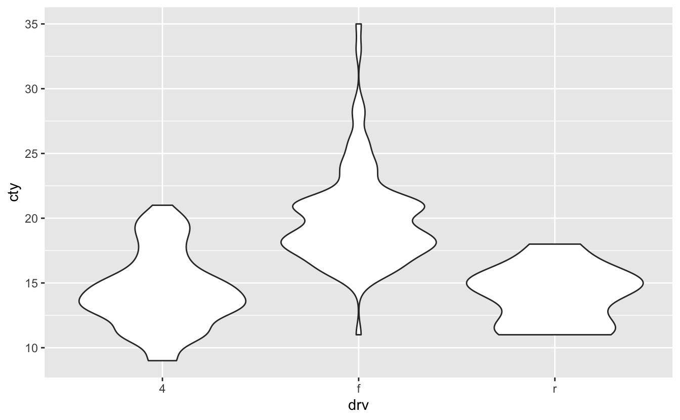
Q3: How is drive train related to fuel economy? How is drive train related to engine size and class?
A: Let’s plot the drv vs cty using geom_point():
ggplot(mpg, aes(drv, cty)) + geom_point()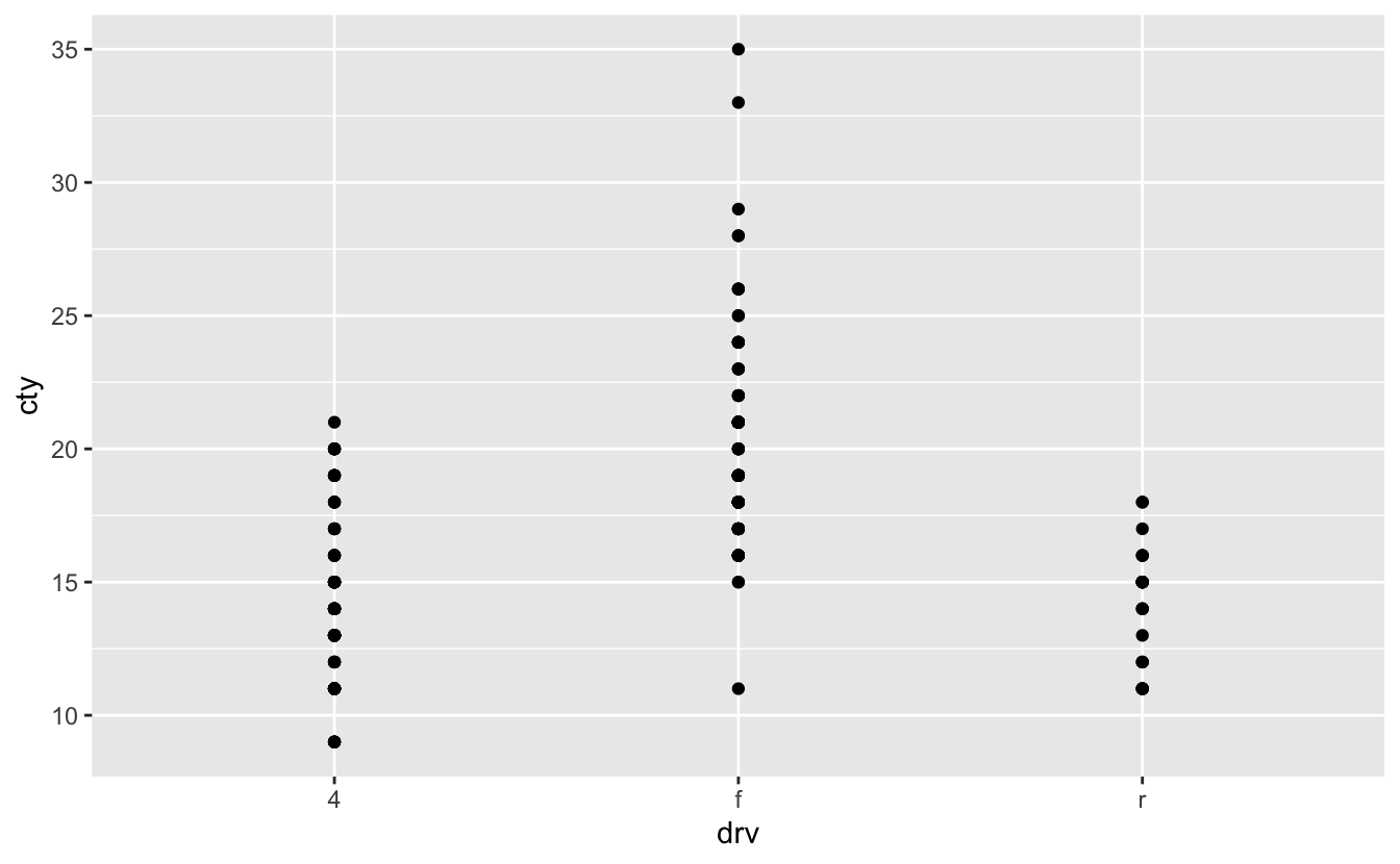
This figure is not so explanatory about the drv and the cty relation. So, we should change the geom_point(). We can use geom_boxplot() or geom_violin() (check section 2.6.2):
ggplot(mpg, aes(drv, cty)) + geom_boxplot()
ggplot(mpg, aes(drv, cty)) + geom_violin()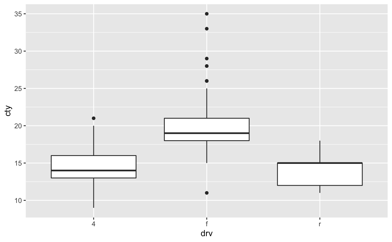
Now let’s plot a figure about the relation of the drv, displ, and class using geom_boxplot():
ggplot(mpg, aes(drv, displ, color = class)) + geom_boxplot()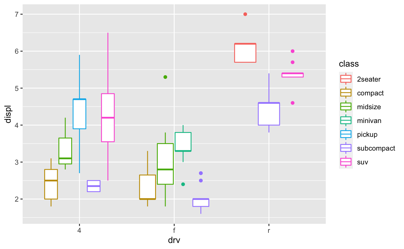
1.4 Faceting
Q1: What happens if you try to facet by a continuous variable like hwy? What about cyl? What’s the key difference?
A: Let’s try faceting by hwy:
ggplot(mpg, aes(displ, cty)) +
  geom_point() +
  facet_wrap(~hwy)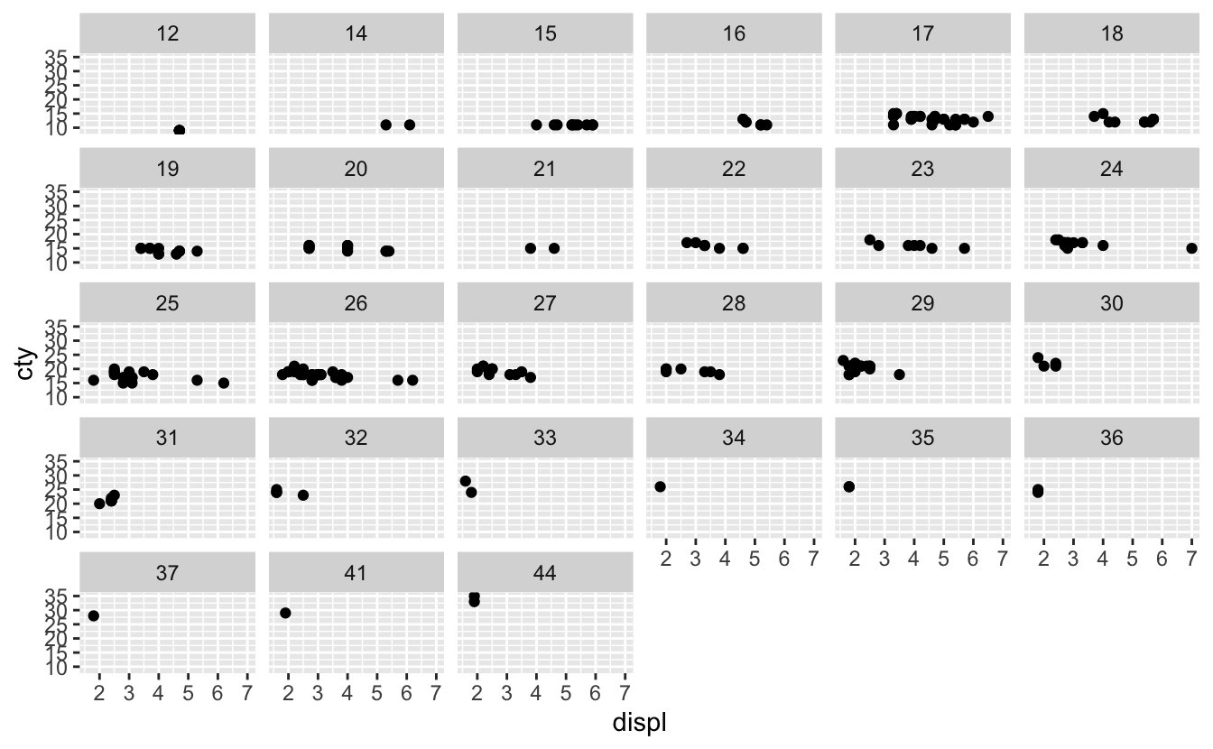
We didn’t get any errors, but it becomes hard to read and interpret this figure because the hwy variable is considered a categorical variable that has too many different levels:
levels(factor(mpg$hwy))
#>  [1] "12" "14" "15" "16" "17" "18" "19" "20" "21" "22" "23" "24" "25" "26" "27"
#> [16] "28" "29" "30" "31" "32" "33" "34" "35" "36" "37" "41" "44"
But this is not the case for the cyl variable:
ggplot(mpg, aes(displ, cty)) +
  geom_point() +
  facet_wrap(~cyl)
Q2: Use faceting to explore the 3-way relationship between fuel economy, engine size, and number of cylinders. How does faceting by number of cylinders change your assessement of the relationship between engine size and fuel economy?
A: Let’s create a plot using cty, displ, and cyl variables. we should choose cyl as the faceting variable because it’s a categorical variable with 4 different levels:
ggplot(mpg, aes(displ, cty)) +
  geom_point() +
  facet_wrap(~cyl)
While there is no reasonable relationship between cty and displ for 5 cylinders cars, it is negative for 4 and 6 cylinders cars, and minor positive relationship for 8 cylinders cars.
Q3: Read the documentation for facet_wrap(). What arguments can you use to control how many rows and columns appear in the output?
A: We can use nrow and/or ncol to control the number of rows and/or columns. e.g.,
ggplot(mpg, aes(displ, hwy)) +
geom_point() +
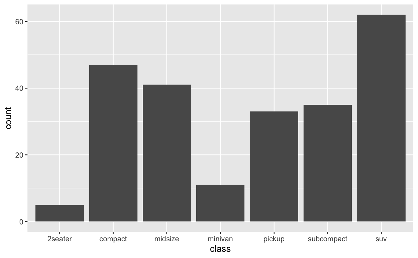
facet_wrap(~class, nrow = 4)
To find the documentation, enter ?facet_wrap() in R console.
Q4: What does the scales argument to facet_wrap() do? When might you use it?
A: This argument controls the scale of the panels’ axes.
For example, if you want to see the patterns within each panel you can use scales = free:
ggplot(diamonds, aes(x = price)) +
  geom_histogram(bins = 100) +
  facet_wrap(~cut, scales = "free")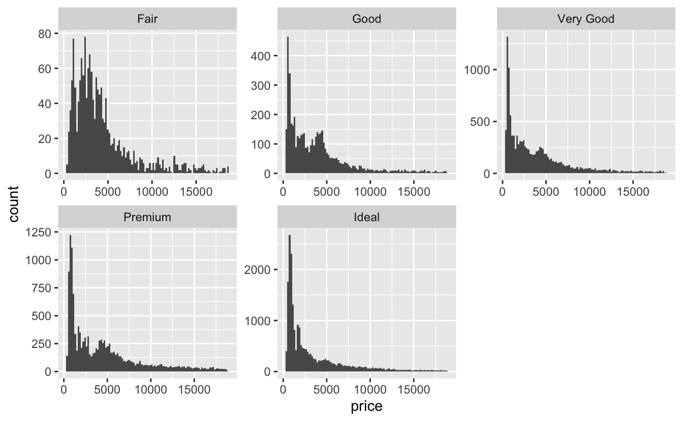
As you can see, the y-axis scales are different between each panel. Now you may see the pattern better, but it’s harder to compare panels with each other.
1.5 Plot geoms
Q1: What’s the problem with the plot created byggplot(mpg, aes(cty, hwy)) + geom_point()? Which of the geoms described above is most effective at remedying the problem?
ggplot(mpg, aes(cty, hwy)) +
  geom_point()
A: As mentioned before, this plot suffers from “Overplotting” problem and to remedy this we can use geom_jitter() or geom_count():
ggplot(mpg, aes(cty, hwy)) +
  geom_point() +
  geom_jitter()

ggplot(mpg, aes(cty, hwy)) +
  geom_point() +
  geom_count()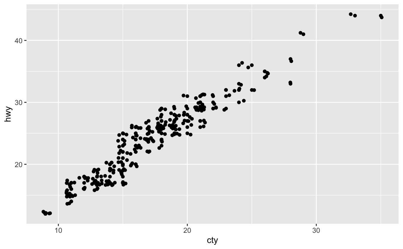
Q2: One challenge with ggplot(mpg, aes(class, hwy)) + geom_boxplot() is that the ordering of class is alphabetical, which is not terribly useful. How could you change the factor levels to be more informative?
ggplot(mpg, aes(class, hwy)) +
  geom_boxplot()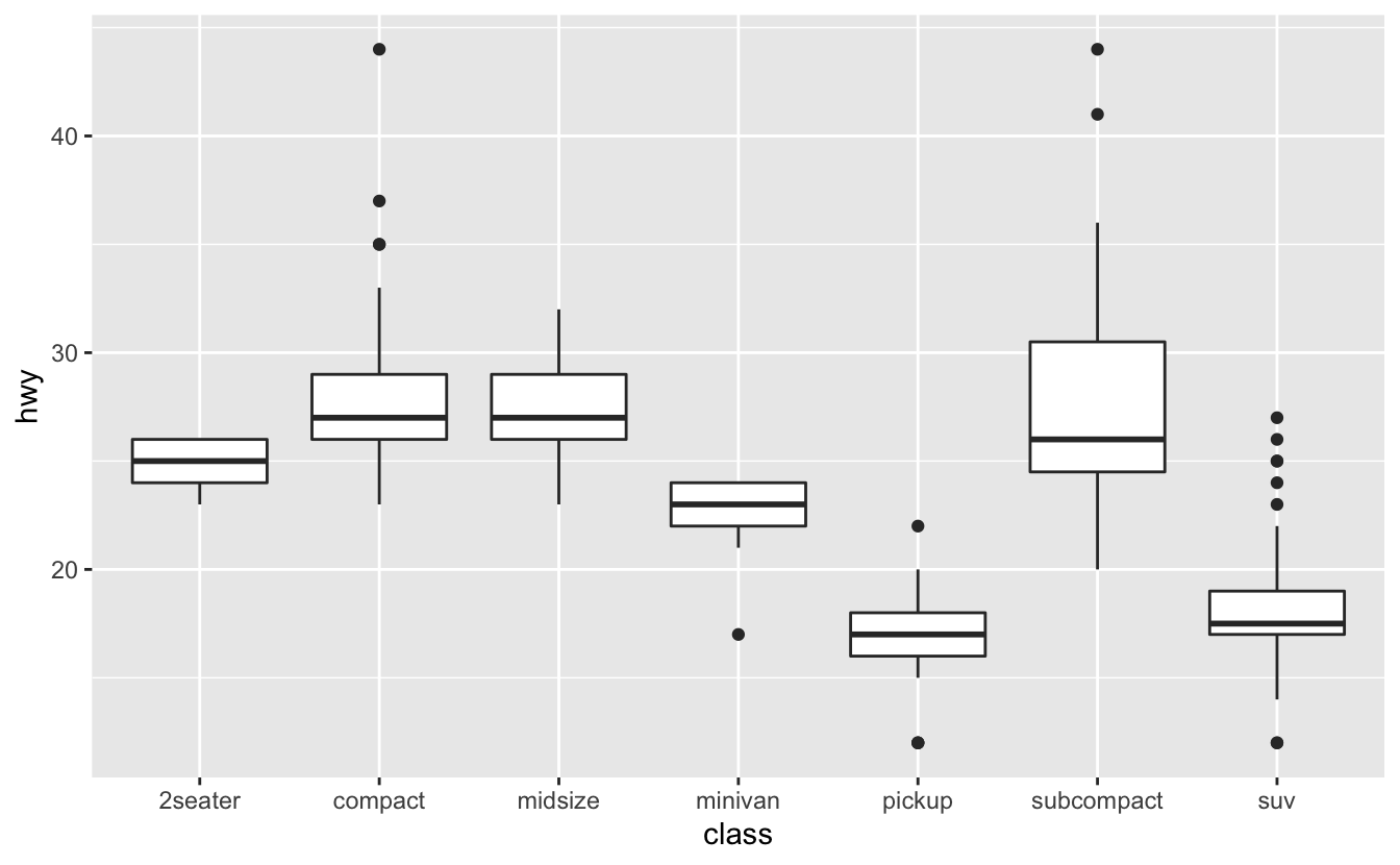
A: We can use reorder() from forcats package:
ggplot(mpg, aes(reorder(class, hwy), hwy)) +
  geom_boxplot()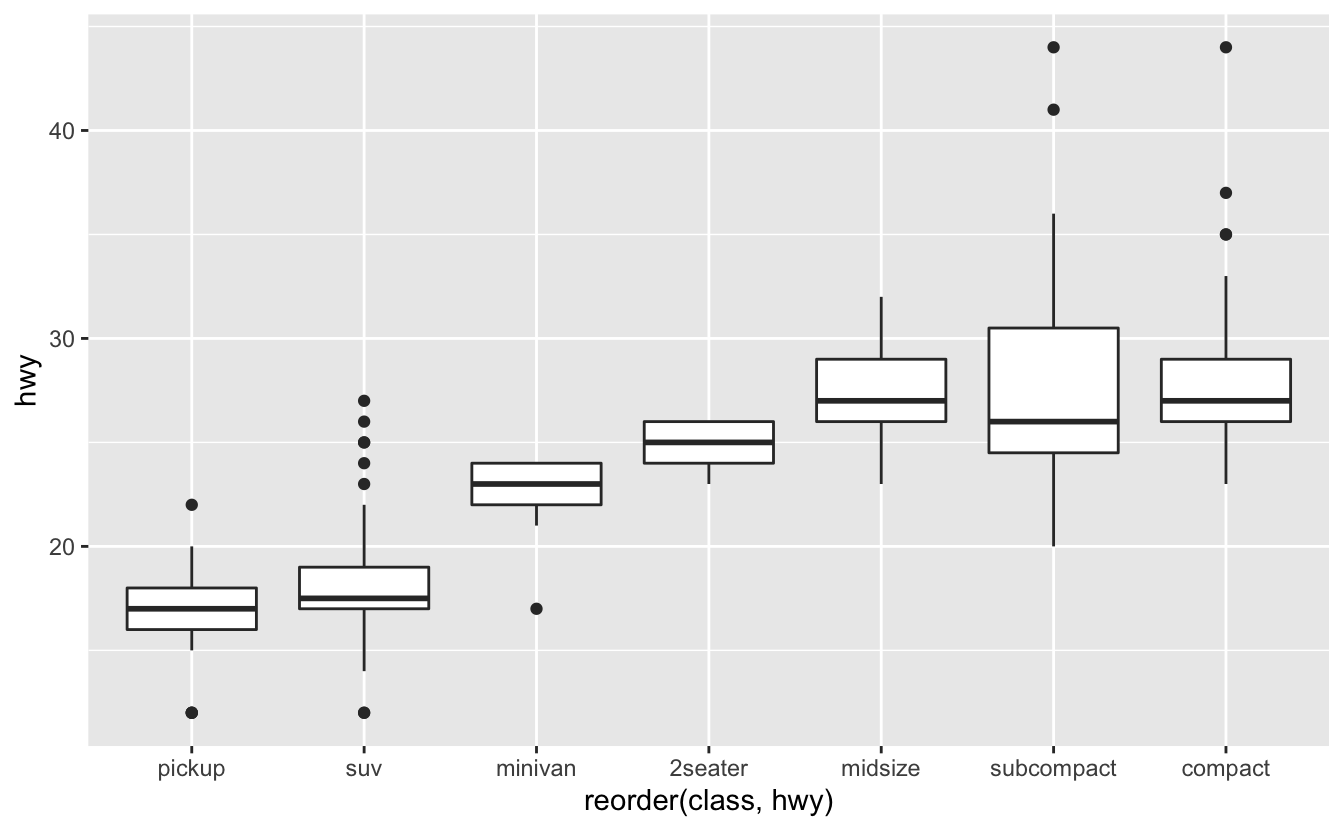
This function reorders the Levels of the class variable using the values of the hwy. You can find its documentation using ?reorder.
Q3: Explore the distribution of the carat variable in the diamonds dataset. What binwidth reveals the most interesting patterns?
A: First, let’s use the default value for binwidth:
ggplot(diamonds, aes(carat)) +
  geom_histogram()
#> `stat_bin()` using `bins = 30`. Pick better value with `binwidth`.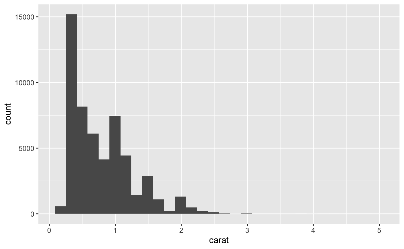
This plot is rigid and didn’t reveal any interesting patterns.
You can change the value of the bins argument in geom_histogram() to find a better binwidth. For example, you can use bin = 150 to see the peaks in the rounded numbers.
ggplot(diamonds, aes(carat)) +
  geom_histogram(bins = 150)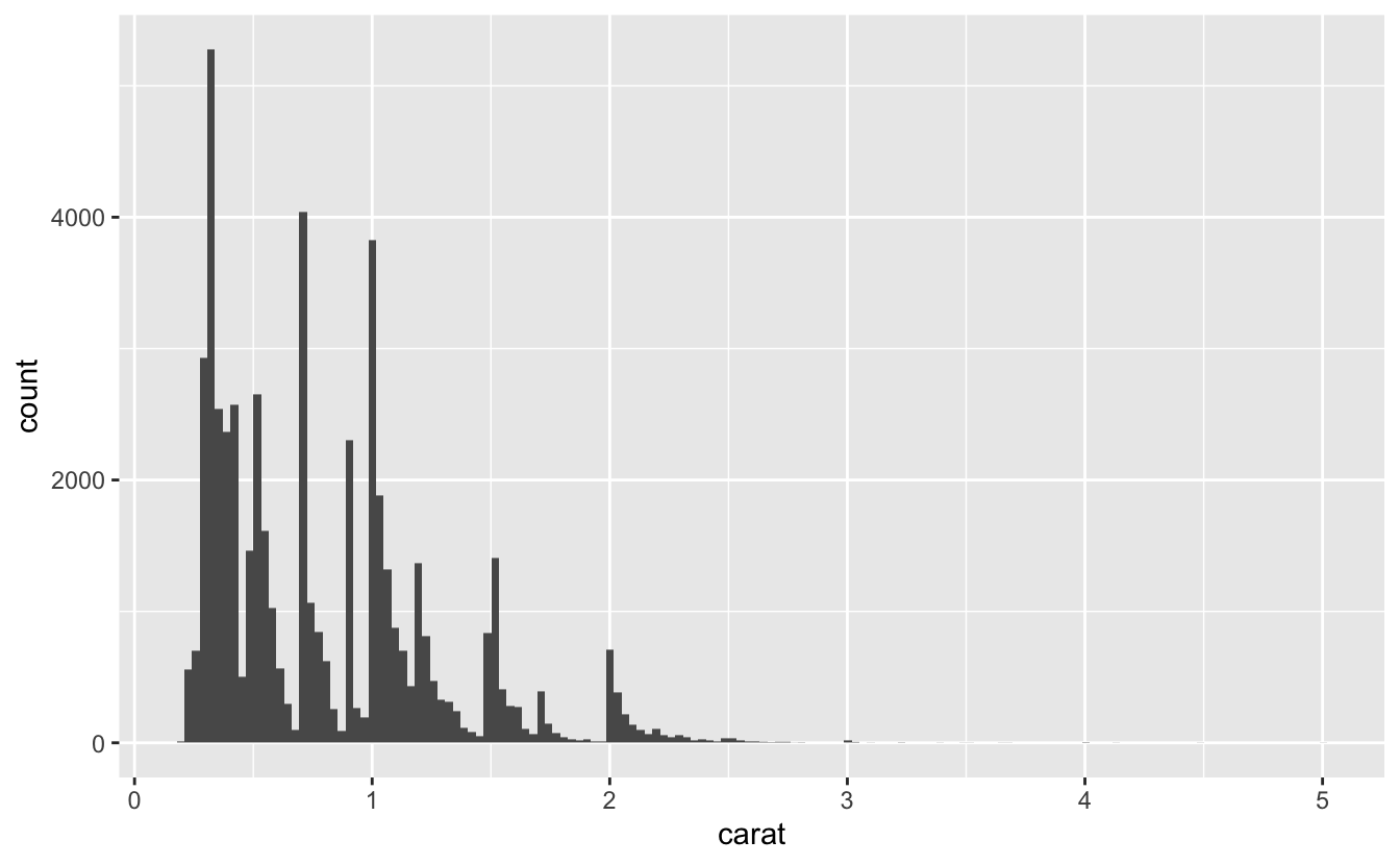
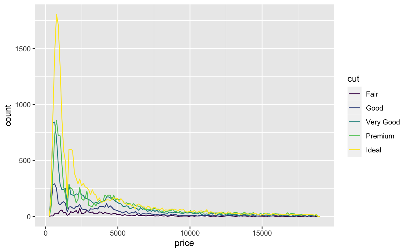
Q4: Explore the distribution of the price variable in the diamonds data. How does the distribution vary by cut?
A: We can use geom_histogram() and facet the plot by cut or using geom_freqpoly and mapping cut to the colour aesthetic:
ggplot(diamonds, aes(price)) +
  geom_histogram(bins = 150) +
  facet_wrap(~cut, scales = "free_y")

ggplot(diamonds, aes(price, color = cut)) +
  geom_freqpoly(bins = 150)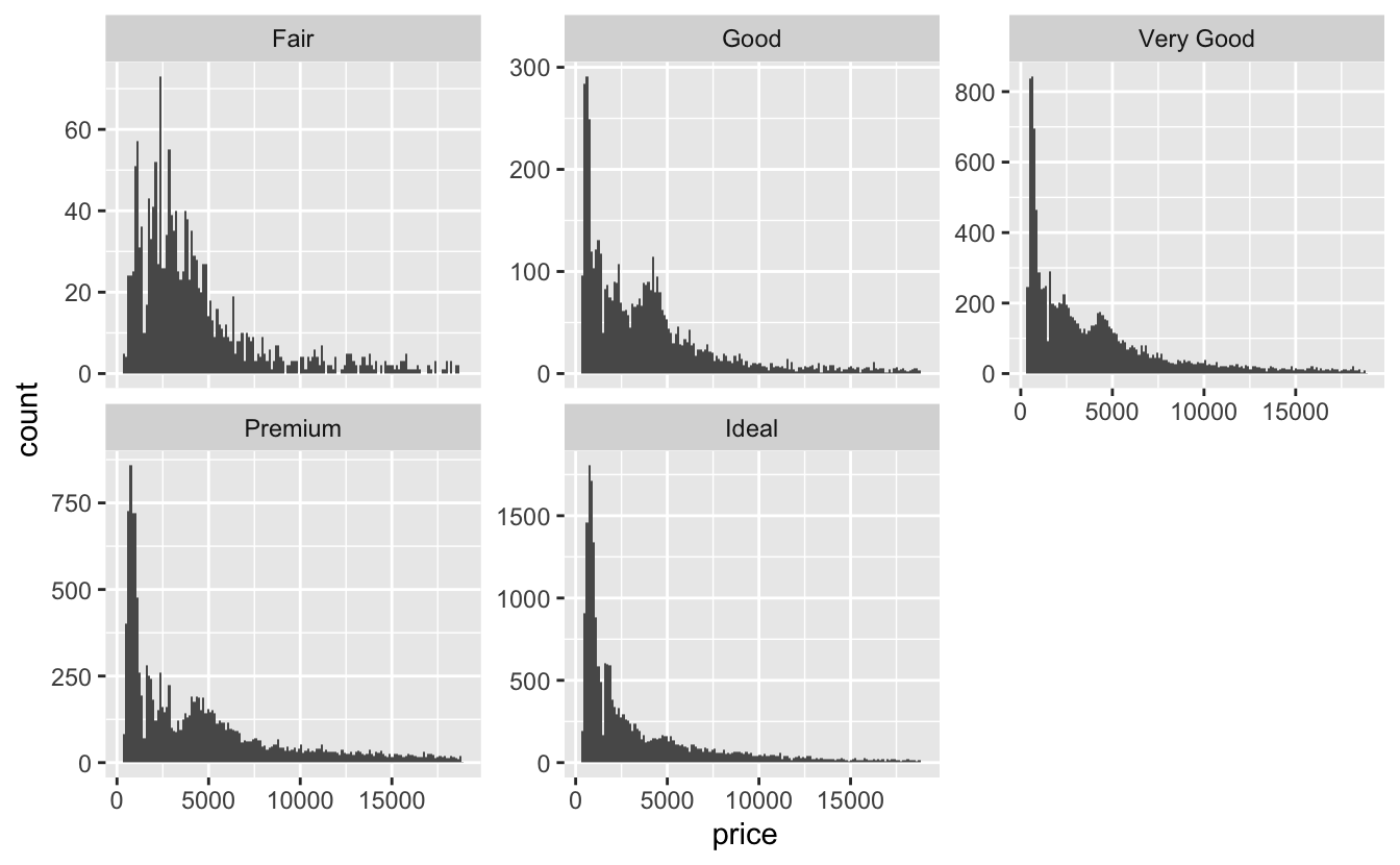
Also we can use geom_violin():
ggplot(diamonds, aes(price, cut)) +
  geom_violin()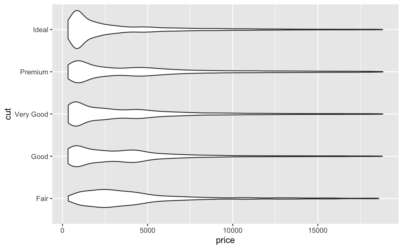
Q5: You now know (at least) three ways to compare the distributions of subgroups: geom_violin(), geom_freqpoly() and the colour aesthetic, or geom_histogram() and faceting. What are the strengths and weaknesses of each approach? What other approaches could you try?
A: geom_violin(): Violin plots give the richest display. they show a compact representation of the density of the distribution, but it can be hard to interpret.
geom_freqpoly() and the colour aesthetic: They are better for comparing distributions of subgroups but harder to find the patterns in each distribution.
geom_histogram() and faceting: Unlike geom_freqpoly() with the colour aesthetic, they are better for finding the patterns in the distributions of subgroups and harder for comparing subgroups.
Q6: Read the documentation for geom_bar(). What does the weight aesthetic do?
A: If the weight aesthetic is supplied, geom_bar() makes the height of the bar proportional to the sum of the weights. e.g.,:
Q7: Using the techniques already discussed in this chapter, come up with three ways to visualise a 2d categorical distribution. Try them out by visualising the distribution of model and manufacturer, trans and class, and cyl and trans.
A: Visualising trans and class:
ggplot(mpg, aes(trans, fill = class)) +
    geom_bar()

ggplot(mpg, aes(trans, fill = class)) +
    geom_bar(position = "fill") +
  ylab("proportion")

ggplot(mpg, aes(x = trans, fill = class)) +
  geom_bar(position = "dodge")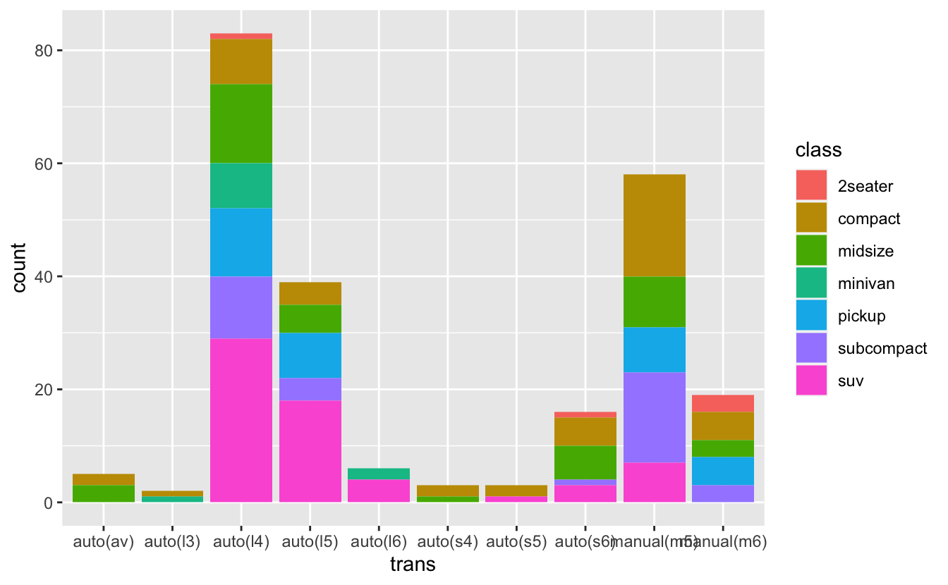


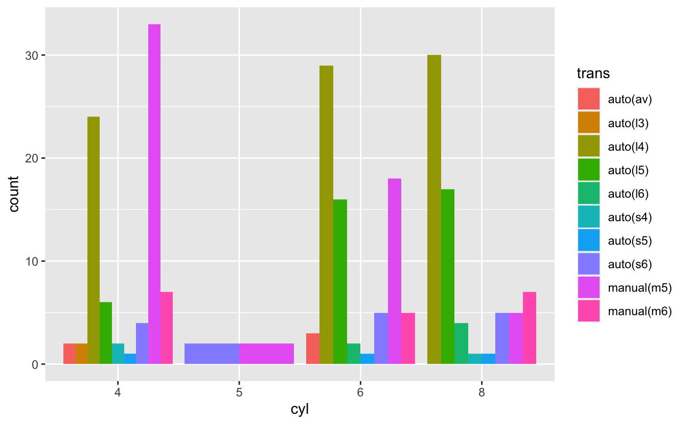
Visualising cyl and trans:
mpg %>%
  mutate(cyl = as.factor(cyl)) %>%
  ggplot(aes(cyl, fill = trans)) +
  geom_bar()


mpg %>%
  mutate(cyl = as.factor(cyl)) %>%
  ggplot(aes(cyl, fill = trans)) +
  geom_bar(position = "fill") +
  ylab("proportion")


mpg %>%
  mutate(cyl = as.factor(cyl)) %>%
  ggplot(aes(cyl, fill = trans)) +
  geom_bar(position = "dodge")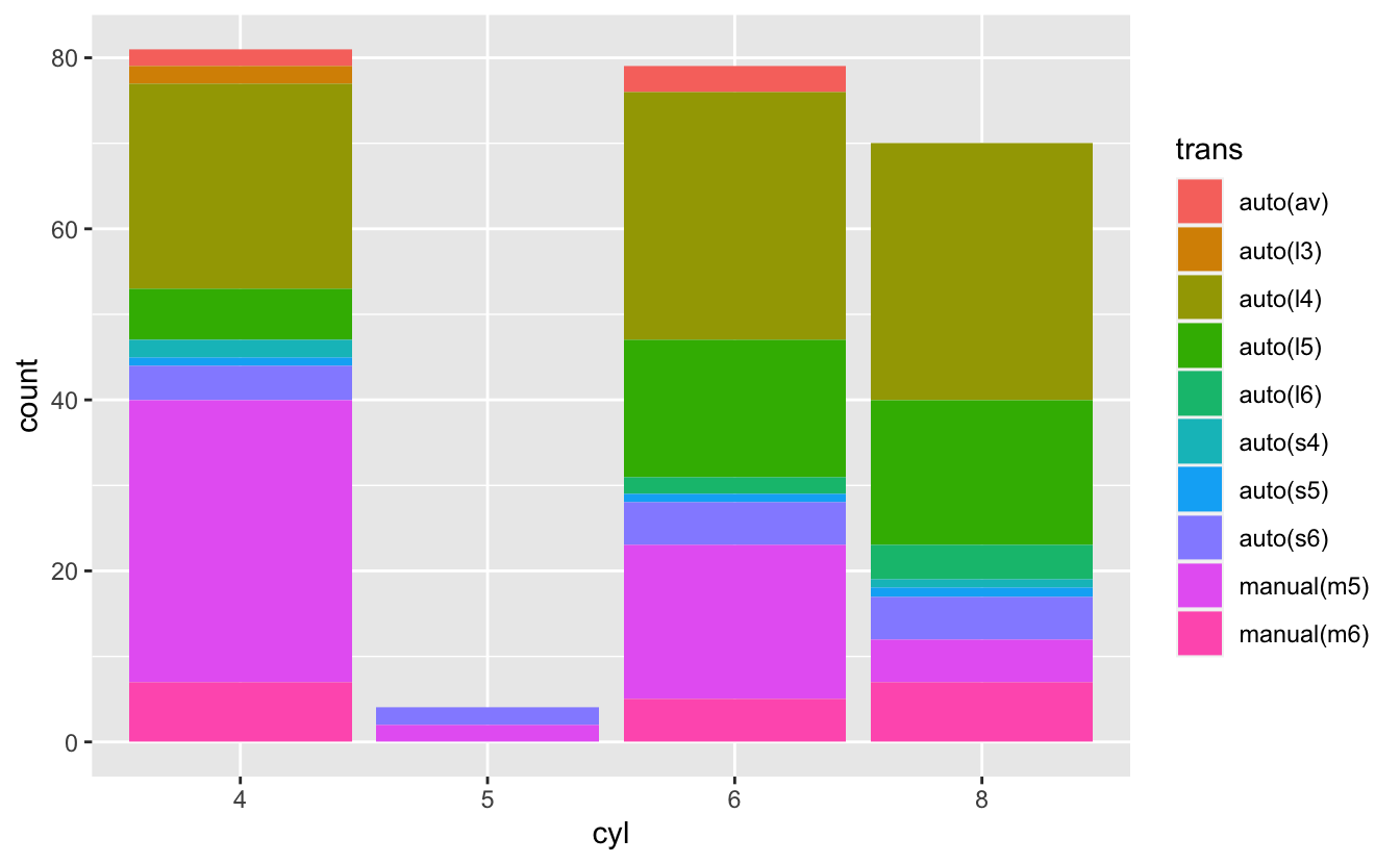

To visualise model and manufacturer, first we need to remove the redundant specification of the drive train then we can use geom_bar():
clean_mpg <- mpg %>%
mutate(model = str_replace_all(model,
c("quattro" = "",
"4wd" = "",
"2wd" = "",
"awd" = "")) %>%
str_trim())
ggplot(clean_mpg, aes(y = manufacturer, fill = model)) +
geom_bar() +
theme(legend.position = "none") # this for removing legend; learn more in section 11.6.1
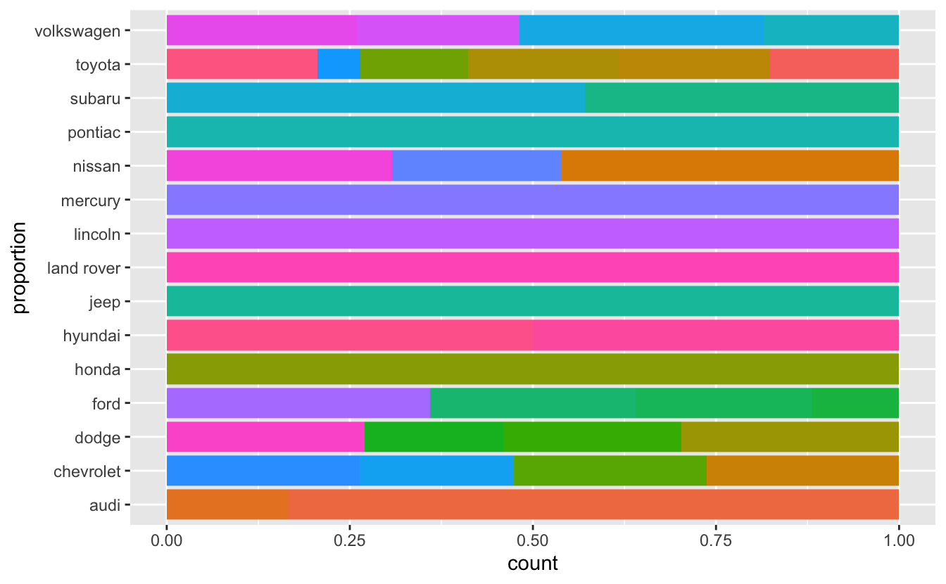
ggplot(clean_mpg, aes(y = manufacturer, fill = model)) +
geom_bar(position = "fill") +
ylab("proportion") +
theme(legend.position = "none")
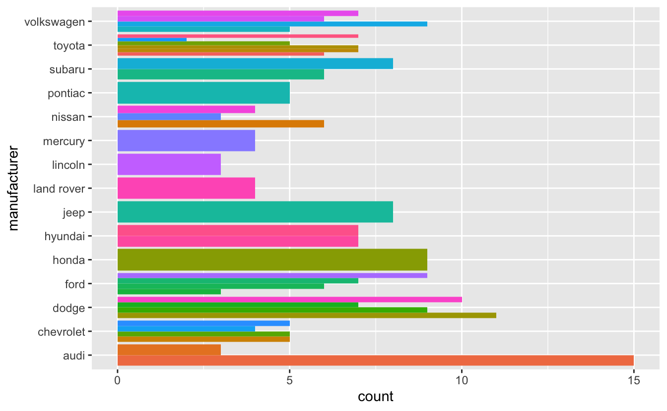
ggplot(clean_mpg, aes(y = manufacturer, fill = model)) +
geom_bar(position = "dodge") +
theme(legend.position = "none")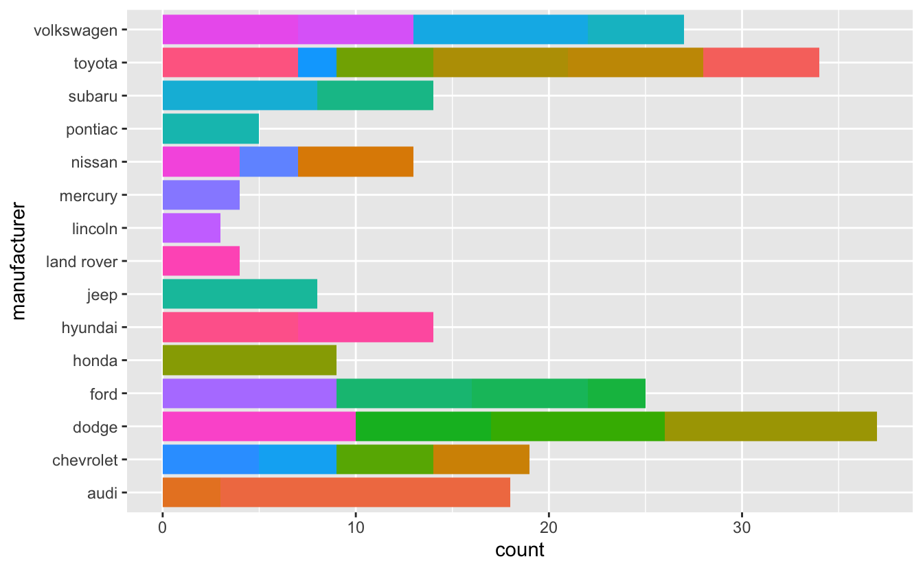
You also may use geom_point() or geom_bar() and faceting.